


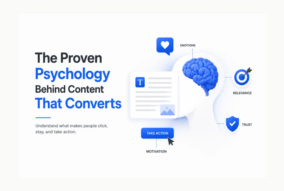
Nobody reads your content because they decided to. They read it because something in the first few seconds made leaving feel like the wrong choice.
Visitors decide within 50 milliseconds whether they will stay on a page or leave, according to research consistently cited by the Nielsen Norman Group and replicated across multiple UX studies. That is faster than a blink. Before a single word of your content has been processed, your reader has already made a subconscious judgment about whether what they are looking at is worth their time.
Most content marketers optimise for the wrong things. They focus on keyword density, word count, and publishing frequency while ignoring the psychological mechanics that determine whether anyone actually reads what gets published. Good SEO gets people to the page. Psychology is what makes them stay, scroll, and act.
This post covers the specific psychological principles behind content that converts. Not vague advice about “knowing your audience.” The actual cognitive science behind why certain headlines stop the scroll, why some content gets read to the end while most gets abandoned in the first paragraph, and why some CTAs get clicked while others get ignored. Each principle comes with a specific, implementable change you can make to your content this week.
The 5-Second Rule – Why the First Impression Is the Only Impression That Matters
In 2026, with faster browsing habits and shorter attention spans, the effective window for a first impression is closer to 5 seconds. The headline answers the visitor’s immediate question: “Is this for me, and does it solve my problem?”
Five seconds sounds like enough time. It is not, when you understand what the brain is doing in those five seconds. When a reader arrives on a page, the brain is not reading. It is pattern-matching. It is looking for visual and cognitive cues that answer three questions almost simultaneously: does this look credible, does this look relevant to what I was searching for, and does this look like it will be worth the effort of reading?
Research suggests it takes just 50 milliseconds for users to form an impression about a website. That response is entirely visual and emotional before it is rational. The page either feels trustworthy and relevant, or it does not. If it does not, the back button gets clicked before the reader has processed a single sentence of your content.
This has a specific implication for how you structure every piece of content. The headline and the first paragraph are not the introduction. They are the entire argument for why the reader should stay. If those two elements do not immediately signal that this page will solve the problem the reader arrived with, the rest of the content will never be read regardless of its quality.
The most effective opening structure for high-converting content is not background or context. It is a specific, concrete statement of the problem the reader came to solve, followed immediately by a signal that this page has the answer. The reader who lands on a post expecting an answer to a specific question and sees that question reflected back at them in the first sentence has a psychological reason to stay. The reader who arrives and sees three paragraphs of general introduction has no reason not to leave.
The Curiosity Gap – Why People Cannot Stop Reading Once It Opens
In 1994, Carnegie Mellon economist George Loewenstein published research arguing that curiosity is not a soft feeling. It is a specific response to an information gap. When you sense there is something you should know but do not, your brain registers that as genuine discomfort. The kind that drives behaviour.
Every piece of content that has ever compelled someone to keep reading is built on this mechanism. The title or opening creates the gap. The content closes it. The reader cannot stop until the gap is closed because the unresolved tension is uncomfortable.
This is why “here are some things to know about content marketing” gets ignored while “the reason your content gets read but never shared is something almost nobody talks about” gets clicked. The first statement is complete. There is no gap. The second statement implies there is something the reader does not know that they should, and the brain immediately wants to close that gap.
The curiosity gap works at every level of content structure. It works in headlines, which should imply an answer without fully giving it. It works in subheadings, where revealing what a section covers should simultaneously create interest in the specific detail it will deliver. It works in paragraph endings, where a question or a partial answer creates the pull into the next paragraph.
The practical application is specific. Before writing any headline, ask whether it creates an information gap or merely describes a topic. “How to write better CTAs” describes a topic. “The CTA mistake that is costing you 90% of your conversions” creates a gap. Both are about the same subject. One gets clicked. The other gets scrolled past.
BuzzFeed’s most successful quiz formats get over 500,000 completions within 48 hours, and none of those people click because they trust BuzzFeed’s research methodology. They click because the title made them feel like there was something specific to find out about their own situation. The curiosity gap is the engine. The content is just the mechanism for closing it.
Loss Aversion – Why Framing Matters More Than Facts
Nobel laureate Daniel Kahneman’s research on loss aversion established one of the most replicated findings in behavioural economics: losses loom larger than gains in human cognition. Losses are perceived as approximately twice as impactful as equivalent gains. This is not a personality trait or a cultural preference. It is a feature of how the human brain processes risk and reward.
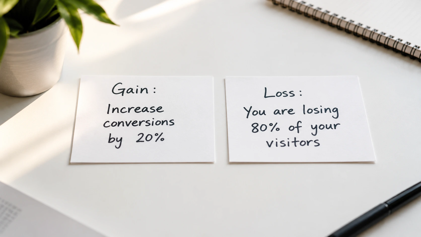
For content, this means the framing of the same information produces dramatically different responses depending on whether it is presented as a potential gain or a potential loss.
“Here is how to increase your content conversion rate by 20%” describes a gain. “Here is why 80% of your content visitors are leaving without converting, and what you are losing” describes a loss.
Both statements are about the same subject. The loss framing consistently produces higher engagement because the brain weights the risk of loss more heavily than the opportunity of equivalent gain.
This principle applies not just to headlines but to the entire structure of high-converting content. The most persuasive content in any niche follows a specific pattern. It opens by establishing what the reader is currently missing or losing by not knowing this information. It then provides the information. It closes by establishing what the reader can gain, or avoid losing, by applying it.
The error most content makes is skipping the first step and going straight to the information. This produces content that is accurate and useful but psychologically flat. The reader has no emotional reason to engage with the information because they do not feel the cost of not knowing it. Establishing what is at stake before delivering the answer is what creates the motivation to actually read and apply what follows.
Social Proof – Why People Need to See Others Choosing Before They Choose
Humans are not primarily rational decision-makers. We are social ones. When we are uncertain about whether to take an action, we look for evidence that other people have already taken it and found it worthwhile. This is social proof, and it is one of the most powerful conversion mechanisms available to content creators.
Social proof works because of a cognitive shortcut the brain uses to reduce the effort of evaluation. If many other people have made this choice, the reasoning goes, then the choice is probably correct. The effort of evaluating all available evidence is replaced by the observation that others have already done that work.
For content, this means that evidence of readership, engagement, and reader outcomes is not just a vanity metric. It is a conversion signal. A post that has been read by 50,000 people and has 400 comments communicates something fundamentally different from an identical post with no social signals attached to it, even if the content quality is exactly the same.
People naturally trust the experiences of other customers. Testimonials and reviews reduce uncertainty and encourage new action. This principle from user psychology directly translates to content: a reader who sees that your previous recommendation helped someone else solve the same problem they are facing is significantly more likely to follow that recommendation.
The practical applications for content are specific. Mentioning the size of your audience, the number of people who have read a particular post, or the results readers have achieved by applying your advice are all social proof mechanisms. Including a testimonial or a reader outcome within a piece of content, particularly near a CTA, dramatically increases the probability that the reader will take that action.
For affiliate content specifically, social proof takes the form of specific documented results. “I used this tool and here is what happened to my traffic in 90 days” with actual numbers attached is social proof that converts at fundamentally higher rates than “I recommend this tool” without any documented outcome.
Cognitive Ease – Why Readers Stop Reading When Thinking Gets Hard
Every piece of content your reader encounters creates what psychologists call cognitive load, the mental effort required to process and understand what is being communicated. When cognitive load is low, reading feels effortless and the reader stays in a flow state that makes continued reading the path of least resistance. When cognitive load is high, reading becomes work, and the reader’s brain starts looking for an exit.
Understanding how to reduce the cognitive load on your visitors means using familiar layouts, clear fonts, and addressing objections before the reader even asks them. If a page is easy to read and navigate, the user is more likely to stay in a flow state and complete the conversion.
The specific elements that increase cognitive load in content are easily identifiable. Long unbroken paragraphs force the reader to hold more information in working memory at once. Unfamiliar vocabulary or jargon requires additional mental processing to translate. Unclear sentence structure creates ambiguity that the brain has to resolve before moving forward. Abstract claims without concrete examples require the reader to generate their own examples, which takes effort.
The specific elements that reduce cognitive load are equally identifiable. Short paragraphs create natural resting points that reduce working memory load. Simple sentence structure eliminates ambiguity. Concrete examples eliminate the reader’s need to generate their own. Subheadings chunk the content into clearly labelled sections that allow the reader to navigate rather than having to hold the entire document structure in working memory.
One finding from content research that surprises most writers: reading level strongly predicts engagement time. Content written at a grade 6 to 8 reading level consistently outperforms equivalent content written at a grade 12 reading level in time on page, scroll depth, and conversion rate, even for sophisticated audiences. The reason is not that the readers are not intelligent enough to handle complex language. It is that reading complex language takes more cognitive effort, and the brain naturally prefers to spend that effort on understanding the ideas rather than the sentences.
The Self-Reference Effect – Why “You” Is the Most Powerful Word in Content
The self-reference effect, documented in psychology research going back decades, shows that information connected to your own identity gets processed more deeply, retained longer, and acted on more readily than information about other things.
This is why the second-person perspective, writing directly to the reader using “you,” consistently outperforms third-person explanations in engagement and conversion metrics. When a reader processes “you are losing 80% of your potential conversions,” the brain tags that information as personally relevant and routes it to deeper processing than it would receive if the same information was written as “businesses lose 80% of potential conversions.”
The self-reference effect also explains why personalised content dramatically outperforms generic content, even when the underlying information is identical. Interactive content is the only format where you can manufacture this feeling at scale, because it creates a result that is specific to the individual rather than presenting the same information to everyone.
The practical application for non-interactive content is specific. Every generalisation should be tested against whether it can be made personal. “Content creators often make this mistake” is less engaging than “you are probably making this mistake right now.” The information is identical. The self-reference makes it feel personally relevant rather than abstractly relevant, and personally relevant information gets acted on.
The most conversion-oriented content writers apply this principle at every level of structure. Headlines address the reader directly. Body paragraphs use “you” rather than “people” or “marketers.” Examples are chosen based on what the target reader specifically experiences rather than what a general audience might experience. CTAs are written as actions the reader takes, not actions they are invited to consider.
CTA Psychology – What Actually Makes People Click
According to research from Unbounce, the average conversion rate on business landing pages is 4.02% in 2026. In some industries this reaches 6.1%. But 90% of the traffic that lands on a site is not converting into anything valuable.
Most of that conversion failure happens at the CTA. Not because the CTA is written badly, but because it violates one or more of the psychological principles that make people willing to take an action.
The psychology of a high-converting CTA has four components that all need to be present simultaneously.
The CTA must be specific about what happens next. “Click here” fails because it tells the reader nothing about what clicking produces. “Get the free content brief template” succeeds because the reader knows exactly what they are getting, can evaluate whether they want it, and can make a decision without uncertainty. Uncertainty is a conversion killer. Every element of ambiguity in a CTA is friction that reduces click probability.
The CTA must feel low risk. The perceived cost of the action determines the willingness to take it. A CTA asking for an email address in exchange for something specific and useful feels low risk. A CTA asking for credit card details on a first visit feels high risk regardless of the monetary amount involved. Reducing perceived risk at the CTA, through guarantees, trial offers, no-commitment language, or social proof of others who have taken the action, directly increases conversion rate.
The CTA must match the reader’s readiness. A reader who is in the awareness stage of their journey and not close to a purchase decision will not click a “buy now” CTA regardless of how well it is written, because it does not match where they are. CTAs that convert are matched to reader intent. An awareness stage reader gets “download the free guide.” A decision stage reader gets “start your free trial.”
The CTA must be visible at the moment of peak engagement, not only at the end of the content. Research from Content Square consistently shows that 80% of readers do not reach the bottom of a long post. A CTA that only appears at the bottom is invisible to most of the audience. Placing an inline CTA after the section of content that delivers the most immediate value, while the reader’s engagement is at its highest, converts dramatically better than the same CTA in the footer.
Visual Hierarchy – Why the Eye Decides Before the Brain Does
The brain processes visual information at a speed that makes text-based processing look glacial. Research from the Nielsen Norman Group shows that users scan pages in predictable patterns, a reading behaviour driven entirely by visual contrast, not by interest in the content.
What this means in practice: readers do not read your content in the order you wrote it. They scan for visual entry points first. The elements that receive the most visual attention are the ones with the highest contrast relative to their surroundings: large headlines, bold text, images, coloured buttons, and subheadings. The body text in between these elements receives attention only after the visual scan has identified the page as worth reading.
This has a specific structural implication for high-converting content. The most important information in any piece of content needs to be visually prominent. If your most compelling argument is buried in a plain body paragraph, the reader who scanned and left before reading paragraph four never received it. The same argument in a highlighted callout box, a bold subheading, or an image caption would have reached every scanner regardless of whether they read the surrounding text.
Page speed is the most overlooked visual hierarchy factor. A page loading in 1 second converts at 3 times the rate of a page loading in 5 seconds. A page that takes 5 seconds to load is losing more than half its potential conversions before a single visitor has read the headline. No amount of CTA optimisation or headline testing can compensate for a fundamentally slow loading page, because a reader who is waiting for content to appear is not a reader. They have already left.
How to Apply These Principles to Every Piece of Content You Publish
Understanding the psychology is only useful if it changes what you produce. Here is the specific checklist that applies all six principles to any piece of content before it goes live.
- The headline creates a curiosity gap. It implies an answer without fully delivering it. It addresses the reader directly using “you” where possible. It is framed around what the reader could lose by not knowing this, not just what they could gain by reading it.
- The first paragraph reflects the reader’s problem back at them with specificity. It does not provide context or background. It starts with the thing the reader came for.
- The body uses short paragraphs of two to four sentences. It uses concrete examples wherever abstract claims would otherwise stand alone. It is written at a reading level that requires no translation effort from the reader.
- Every section ends with either a direct statement of the key takeaway or a question that creates pull into the next section.
- The CTA is placed inline after the highest-value section of the content, not only at the end. It is specific about what the reader gets. It uses second-person language. It reduces perceived risk through explicit low-commitment framing.
- Social proof is present near the CTA in the form of a specific outcome, a reader result, or an audience size signal.
If you want to put these principles into practice on your social content without rebuilding every post from scratch, Predis AI generates content specifically optimised for the psychological triggers that drive engagement and saves on social platforms.
I use it at The Marketing Shelf to create carousel scripts and social posts that are structured around curiosity gaps and self-reference rather than generic promotional copy.
CONCLUSION:

High-converting content is not a writing style. It is an understanding of how the brain makes decisions and a structure that works with those decisions rather than against them.
The 50-millisecond first impression determines whether the reader stays. The curiosity gap determines whether they keep reading. Loss aversion framing determines whether the content feels urgent or optional. Cognitive ease determines whether reading stays effortless or becomes work. Social proof determines whether the reader trusts the recommendation. And CTA specificity and placement determine whether any of the above actually produces a conversion.
None of these principles require a bigger content budget or more publishing volume. They require applying what cognitive science has established about human decision-making to the specific structure of each post, headline, and CTA you produce. That is a craft skill, and it is entirely learnable.
The readers are already arriving. What you do with their attention in the first five seconds determines whether they become subscribers, buyers, or just another exit in your analytics.
FAQs
Q: What makes content psychologically compelling?
A: Psychologically compelling content works by activating specific cognitive mechanisms: the curiosity gap, which creates an information tension the reader needs to resolve; loss aversion framing, which makes the cost of not reading feel real; and the self-reference effect, which makes the content feel personally relevant rather than generally informative. These mechanisms combine to make reading feel like the more comfortable choice than leaving, which is the psychological foundation of high-converting content.
Q: Why do people click on some headlines but not others?
A: People click on headlines that create what psychologist George Loewenstein called an information gap, a sense that there is something specific they should know but currently do not. Headlines that describe a topic without implying an unrevealed answer do not create this gap. Headlines that imply a specific answer exists, but require clicking to access it, activate the curiosity gap mechanism and produce dramatically higher click rates. Loss aversion framing, emphasising what the reader could be missing rather than what they could gain, amplifies this effect.
Q: How does cognitive ease affect content conversion?
A: Cognitive ease is the measure of how much mental effort reading requires. When cognitive load is low, reading stays in a flow state and the reader continues naturally. When cognitive load is high, the brain starts looking for an exit. Short paragraphs, simple sentence structure, concrete examples, and familiar vocabulary all reduce cognitive load. Research consistently shows that content written at a grade 6 to 8 reading level produces higher engagement and conversion than equivalent content at a grade 12 level, even for sophisticated audiences.
Q: Where should CTAs be placed for maximum conversion?
A: Research from ContentSquare shows that 80% of readers do not reach the bottom of long posts, making footer-only CTAs invisible to most of the audience. CTAs placed inline after the highest-value section of content, at the moment of peak reader engagement, convert significantly better than the same CTA placed only at the end. The most effective CTA placement is immediately after the section of content that delivers the most immediate useful insight to the reader.
Q: How does social proof work in content marketing?
A: Social proof works through a cognitive shortcut where uncertainty about whether to take an action is resolved by observing that others have already taken it. When readers see evidence that your content has been read widely, that your recommendations have produced specific documented results for others, or that previous readers have found the advice worth acting on, the brain uses this as a credibility signal that reduces the perceived risk of following the recommendation. Specific documented outcomes near a CTA, such as actual traffic numbers or revenue results attributed to a tool or strategy, convert at significantly higher rates than recommendations without social evidence.